생각의 경로를 여는 모뉴먼트
From DI Monuments to New Ways of Thinking
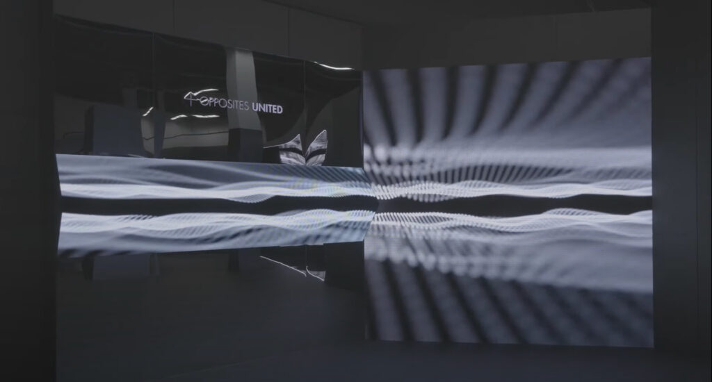
격년마다 열리는 ‘광주디자인비엔날레’. 올해의 주제는 ‘d-Revolution’이었다. 디자인의 혁신성을 강조하겠다는 확고한 취지가 제목에 선명하게 드러난다. 거의 모든 관을 샅샅이 돌고 마주친 기아의 부스는 강렬했다. 다른 부스와는 달리 메탈릭한 소재로 공간의 벽면, 기둥까지 원래 장소를 다른 장소로 탈바꿈하는 적극적인 설치를 선보였다. 공간 구성을 하기에 여간 난해한 것이 아닌 비엔날레관을 이렇게 바꿔놓을 수 있다니, 과연 과감한 선택이었다. 전시 공간에는 기아디자인센터의 아이덴티티 영상뿐만 아니라 미디어 설치까지, 쿨하고 세심하게 고려한 전시 요소들이 관객을 기다리고 있었다. 자동차의 실물을 전시해 보여주는 대신, 기아의 새로운 디자인 철학인 ‘오퍼짓 유나이티드Opposites United(이하 OU)’와 ‘다섯 개의 기둥(5 Pillars)’이 전면으로 드러나 있었다. 디자인비엔날레에 참여하는 당위가 그 어느 부스보다 확고해 보였고, 미디어월, 모니터 속의 영상, 디자인 아이덴티티 모뉴먼트(DI Monument)까지 풍부한 시각 자료가 돋보였다.
The Gwangju Design Biennale is held every two years. This year’s theme was “d-Revolution” (short for “Design Revolution”). The organizer’s firm intention was to emphasize the innovativeness of design, which was clearly revealed in the biennale’s theme title. Kia’s booth, which you could find after combing through all the other exhibition areas, was intense. Unlike other venues, Kia was resolved to highlight installations that transformed the original space, including its walls and columns, into somewhere else altogether through metallic materials. It was a really bold choice for Kia to change the Biennale Hall the way they did because it was so difficult to organize the venue from an exhibitor’s perspective. At the exhibition venue, cool and meticulously selected exhibits were waiting for the audience, from the Kia Design Center’s identity video to media installations. Instead of displaying the real automobiles, Kia exposed the company’s new design philosophy “Opposites United (OU)” and “Five Pillars” at the forefront. The appropriateness of the exhibitor’s participating in the Design Biennale seemed more solid than in any other booth, while the rich visual materials, such as the media wall, the videos on the monitors and the DI monuments Kia had made themselves, really stood out.
자동차의 실물을 전시해 보여주는 대신, 기아의 새로운 디자인 철학인 ‘오퍼짓 유나이티드’와 ‘다섯 개의 기둥’이 전면으로 드러나 있었다.
Instead of displaying the real automobiles, Kia exposed the company’s new design philosophy “Opposites United (OU)” and “Five Pillars” at the forefront.
공간이나 조형물 자체에 사용한 소재의 대부분은 반사가 되는 메탈릭한 소재와 미러, 그리고 반대편에서 투과되는 하프 미러다. 가까운 미래에 기술 문명 시대의 완전한 진보를 상징하는 영화 속 세트 공간처럼 느껴졌다. 다루는 소재의 특성과 디자인 철학의 개연성이 있는지 궁금했다. 전시 공간 디자인을 기획한 SI 그룹의 한현수 책임은 빛을 반사하는 성질을 가진 미러 소재의 물성이 기아 디자인 철학인 OU를 상징할 수 있지 않을까 생각했다. 때로는 공간을 완전하게 분리하는 차단막의 효과를 가지면서도, 서로를 무한히 비추면서 공간에 대한 개념을 확장하는 매우 상반되는 성질을 가졌기 때문이다. 디자인 철학을 지지하는 다섯 개의 기둥은 기아가 계속 출시하는 자동차의 디자인 개념과 아주 밀접하게 연계되어 있었다. 이번에 전시된 세 가지 디자인 아이덴티티 모뉴먼트 역시 OU 및 5 Pillars와의 개연성이 무척 높아 보였다. 미디어와 결합한 일련의 조형물은 추상적이지만 역동적인 감각을 부르는 요소들이 다분했다. 나무와 메탈, 거울과 LED 패널 등 서로 쉽게 달라붙지 않는 것이 적극적으로 결합되어 있었다. 이 오브제를 기아 디자인 철학으로 읽어볼 수 있을까?
Most of the materials used in the booth or in the installations themselves were reflective metallic materials, mirrors, and half mirrors that penetrate from the other side. It felt like a movie set that symbolized the complete progress of the technological civilization in the near future. I wondered if there was a connection between the characteristics of the materials and Kia’s design philosophy. Han Hyunsoo of the Space Identity Group (SI) planned the exhibition venue design, and believed that the physical properties of mirror material that reflects light could symbolize Kia’s design philosophy, OU. This is because sometimes a mirror has the effect of serving as a barrier that completely separates spaces, but has a very contradictory property of expanding the spatial concept while reflecting each side indefinitely. The Five Pillars supporting the company’s design philosophy were very closely related to the design concept of the cars that Kia continues to release. The three design identity monuments exhibited in Gwangju also seemed to be highly associated with OU and the Five Pillars. A series of installations combined with media arts were abstract in form but had many elements that evoked dynamic sensibilities. Things that do not easily stick to each other, such as wood & metal and mirrors & LED panels, were successfully combined. This raised the question of whether these objects could be understood through Kia’s design philosophy.
대조와 조화를 동시에 추구하는 ‘Power to progress’ 섹션의 오브제는 하나의 조형물 안에 자연과 시간의 힘으로 가공된 것과 기계적이고 정밀하게 가공된 것을 집약했다. 오브제 뒤로 무한히 공간감을 만들어내는 영상이 서로 다른 질감의 재료들에 반사되거나, 그 재료를 투과하며 둘 사이를 결합하고 있었다. 외장 디자인 2팀의 김현성 연구원은 ‘Power to progress’를 ‘상상력의 힘’이라고 생각했다. 다듬어지지 않은 날 것의 질감과 그것을 정밀하게 감싸고 있는 정제된 요소를 결합한 개념을 구현했다. 날 것의 질감이 어떻게 정제되어 가는지, 어떤 방향으로 다듬어질지 상상해볼 수 있도록 만든다.
The object in the “Power to Progress” section, which pursues contrast and harmony at the same time, combined what is processed by the forces of nature and time and what is processed mechanically and precisely in one installation. Behind the object, images that create an infinite sense of space were reflected on materials of different textures, or were passing through the materials, combining them as this occurred. Kim Hyunsung, a researcher at External Design Team 2, considered the power to progress as the power of imagination. He embodied the concept of combining the untrimmed texture of the raw material and the refined elements that precisely cover it from the outside. This allows viewers to imagine how the texture of the raw material is refined and in what direction it will be polished.
Senior researcher Han Hyunsoo considered placing the three-dimensional cube in a wholly unusual direction, capturing the message of “Technology for Life” in the cube, which had the concept of OU applied to it. © KIA
한편 메탈릭하면서도 미디어와 복합된 표면을 가진 정육면체 큐브는 현실 3차원 세계와는 대조된 형태를 가지고 있다. 큐브의 뾰족한 모서리로 세워져 비현실적인 자세를 취하고 있으면서, 여섯 개의 면에 역동적인 영상이 흘러간다. 안정감과 불안정함을 동시에 가지며, 정적인 면모와 다변하는 양상을 한 번에 보여준다. ‘Technology for life’처럼 마치 기술과 세계의 접점을 찾아 나가는 이상적인 여정 같아 보이기도 한다. 이번 기아의 전시공간과 모든 조형물은 OU를 근간으로 하고 있다. 이 조형물을 기획한 한현수 책임은 3차원 공간을 역방향으로 사고하며 정육면체 큐브를 떠올렸고, 그 안에 기아디자인센터의 메시지를 담았다. ‘Technology for life’는 기아가 가진 기술과 노하우를 통해 고객과 세상에 더 다양한 미래를 전달하겠다는 약속과도 같다.
On the other hand, the metallic cube, whose surface is combined with media arts, has a form that is in contrast to the real three-dimensional world. Standing on one sharp point, the cube strikes an unrealistic pose as dynamic images flow on all six of its sides. This represents both stability and instability, while showing static and rapidly changing aspects at the same time. As the slogan “Technology for life” implies, it seems like an ideal journey to find the interface between technology and the world. Kia’s exhibition venue and all the installations are based on OU. Han Hyunsoo, the planner of this booth, thought of a three-dimensional space in the reverse direction and came up with a cube, capturing the Kia Design Center’s messages in it. “Technology for life” is Kia’s promise to deliver a more diverse future to customers and the world through the company’s technology and knowhow.
‘Technology for life’는 기아가 가진 기술과 노하우를 통해 고객과 세상에 더 다양한 미래를 전달하겠다는 약속이다.
“Technology for life” implies, it seems like an ideal journey to find the interface between technology and the world.
한편 나무와 금속이 강렬한 대비를 이루는 기둥 형태의 오브제는 목재에서 쏘아 올린 빛을 메탈릭한 소재가 반사하면서 전시 공간의 다른 부분에도 빛의 잔상을 남기고 있었다. 자연이 만들어내는 규칙성과 인간이 만들어내는 규칙성을 하나의 조형물에 구현한 결과는 윗부분과 아랫부분이 극명하게 다르면서 동시에 흡사해 보인다. 재료만 다를 뿐 사실 둘의 기원은 같은 것 아닐까. 모뉴먼트를 기획한 퓨처모빌리티디자인 TFT팀의 김동주 연구원은 상반된 두 가지에서 공통점을 찾아 조화롭게 표현하는 것을 OU라고 생각했다. 자연을 존중하는 것에서부터 ‘Bold for nature’의 속성을 찾았다. 가공하지 않은 나무를 그대로 기둥으로 사용하는 한국 전통 건축의 특징에서 착안하기도 했다. 자연의 아름다움을 수용하는 인공의 아름다움을 기둥을 통해 드러내 보였다.
Meanwhile, the pillar-shaped object, in which wood and metal are in intense contrast, reflected light emitting from wood with the metallic material, leaving an afterimage of light in other parts of the exhibition space. The results of implementing the regularity created by nature and the regularity created by humans in a single installation clearly showed the different upper and lower parts as it created similarity at the same time. Only the materials are different, but in fact the origin of the two parts may be seen as the same. Kim Dongjoo, a researcher at the Future Mobility Design TFT, and the person responsible for planning this monument, thought OU could find common ground in two conflicting things and express them in harmony. The attributes of “Bold for Nature” were found in our respect for nature. It was also conceived of from the characteristics of traditional Korean architecture, which uses raw wood as a pillar. Through the pillar, the artificial beauty that embraces the beauty of nature was revealed.

기아 전시장은 홍보나 정보 전달이 아닌 독특한 위상을 갖고 있었다. 기아의 디자인 철학과 그 철학을 모티브로 한 오브제가 사람들을 끌어당겼다. 기존 디자인비엔날레 부스에서 개인의 작품이나 브랜드 홍보에 집중했던 것을 떠올리면 기아의 선택은 신선했다. 새로운 디자인 철학의 개념을 조형 언어로 소통하고자 하는 시도가 분명했기 때문이다. 더불어 공간 안에 들어간 오브제를 독립시키기보다, 공간 전체를 하나의 디자인 철학 오브제로 구성한 점 또한 주지할만한 대목이다. 미디어월, LED 패널, 모니터 등의 미디어와 추상적 조형물, 그리고 공간으로 확장한 디자인은 기아 디자인 철학을 통합적으로 시사하고 있었다. 전시의 매체인 전시장이라는 공간이 어떤 장소인지, 어떤 장소이길 바라는지에 대한 생각과 태도가 물씬 전해졌다. 기아의 디자인 아이덴티티 모뉴먼트는 결코 하나의 상징으로 귀결되지 않는 OU의 개념적 요소를 조형화하면서 동시에 다른 생각의 경로를 열어놓는다.
The Kia booth indeed had a unique status, as it did not focus on PR or information delivery. Kia’s design philosophy and objects associated with this philosophy as motifs attracted many visitors. Kia’s presentation was fresh, especially when one considered that design biennale booths usually focused on promoting an individual designer’s works or brands. Kia clearly showed its attempt to communicate the concept of the company’s new design philosophy through formative language. In addition, it was noteworthy that the entire space was organized as one design philosophy object, rather than making individual objects inside the booth the focal point. The media wall, LED panels, monitors, abstract installations, and design extended throughout the entire venue presented Kia’s design philosophy in an integrated way. In short, Kia’s thoughts and position about what made the ideal, most desirable exhibition venue were clearly conveyed. Kia’s DI monuments shape the conceptual elements of OU, which never ends in a single symbol, while at the same time opening up other paths to new thoughts.
기아의 디자인 아이덴티티 모뉴먼트는 결코 하나의 상징으로 귀결되지 않는 OU의 개념적 요소를 조형화하면서 동시에 다른 생각의 경로를 열어놓는다.
Kia’s DI monuments shape the conceptual elements of OU, which never ends in a single symbol, while at the same time opening up other paths to new thoughts.
글 박수지
서울을 기반으로 활동하는 독립 큐레이터. 전시기획사 ‘에이전시 뤄뤼AGENCY RARY’를 운영한다. 독립문화공간 ‘아지트’ 큐레이터, 미술문화비평지 《B-art》 편집팀장, 《2017 제주비엔날레》 큐레토리얼팀 코디네이터, 통의동보안여관 큐레이터로 일했다. 《7인의 지식인》(2020), 《줌 백 카메라》(2019), 《정은영 : 어리석다 할 것인가 사내답다 할 것인가》(2018), 《김정헌X주재환 : 유쾌한 뭉툭》 (2018), 《민중미술2015 : 우정의 외면》(2015) 등을 기획했다. ‘Korea Research Fellow: 10×10’(2018, 2019), ‘두산 큐레이터 워크샵’(2019)에 선정된 바 있다.
Contributor Park Suzy
Park Suzy is an independent curator based in Seoul. She runs an exhibition agency called AGENCY RARY. She has worked as a curator at the independent culture space Agit; as editor-in-chief for B-art, a critical journal on arts and culture; a coordinator of the curatorial team of the Jeju Biennale 2017; and a curator for BOAN 1942, an art space in Seoul. She has curated exhibitions such as Seven Intellectuals (2020), Zoom Back Camera (2019), Siren Eun Young Jung: Foolish or Mannish (2018), Kim Jungheun X Joo Jaehwan: Pleasantly Bluntly (2018), and Minjung Art 2015: Freundschaft (2015). Park was also selected for the Korea Research Fellow 10×10 project (2018, 2019) and the Doosan Curator Workshop (2019).