현대적으로 재해석한 한국의 미감
Contemporary Reinterpretations of Korean Aesthetics
그래픽 디자이너 채병록은 한국의 전통적인 요소를 가져와 현대적이고 활기 넘치는 이미지로 재탄생시킨다. 금세 사라지지 않고 오래도록 남는 것에 대해 고민하며, 본질을 흐리지 않는 선에서 시각적인 실험을 지속하는 그의 작업은 전통의 긍정적인 가치를 내포하고 있다. 시리즈로 작업한 〈축, 복〉부터 현재 국립현대미술관 과천관에 전시 중인 작품에 이르기까지 채병록의 작업 세계를 이루는 다양한 레이어에 관해 대화를 나눴다.
Graphic designer Byungrok Chae makes use of traditional Korean elements and transforms them into images that are both vibrant and contemporary. He thinks deeply about what does not immediately disappear but instead remains extant for a long length of time as he continues with his visual experiments that do not obscure the memory’s essence. His work implies that traditions have an inherent positive value to them. From the Congratulations and Blessings series to the works currently on display at the MMCA Gwacheon, we talked about the various layers that make up Byungrok Chae’s art world.
About the Interviewee
일본 타마미술대학에서 그래픽 표현 전공으로 석사 학위를 받았다. 2014년부터 디자인스튜디오 CBR Graphic을 운영하며 다양한 문화단체 및 기업과 활발히 협업 중이다. 런던 빅토리아 앤 앨버트 뮤지엄, 뮌헨 국제디자인박물관, 국립한글박물관 등에서 작품을 소장하고 있다. 현재 이화여자대학교 조형대학 디자인학부와 건국대학교 예술디자인대학 커뮤니케이션디자인학과에서 겸임교수를 맡고 있다.
Byungrok Chae received his MFA in Graphic Design (with a specialization in graphic expression) at Tama Art University in Japan. Since 2014, he has run a graphic design studio called CBR Graphic, and works on a wide variety of projects in collaboration with cultural organizations and businesses. His works are housed at the Victoria and Albert Museum (London), the Pinakothek der Moderne (Munich), and the National Hangeul Museum (Seoul). He is currently an adjunct professor at Ewha Womans University’s College of Art & Design and Konkuk University’s Communication Design Department.
Q1.
‘한국적인 미’를 표현하는 그래픽 디자이너로 잘 알려져 있으세요. CBR Graphic 설립 초반부터 한국적인 요소를 작업에 활용하셨는데 계기가 궁금합니다.
Q1.
You are well known as a graphic designer who expresses uniquely Korean aesthetics. Since CBR Graphic opened its doors for business, you have been using different Korean elements for your work. Is there any specific reason for this?
일본에서 공부하고 한국으로 돌아왔을 때 새로운 개념의 스튜디오를 운영해보고 싶었어요. 많은 직원과 함께 큰 작업을 하는 것보다 제 정체성이 오롯이 담긴 작업을 하기 위해 탐구를 지속했습니다. 오래가는 것, 오래 함께 할 수 있는 것에 대한 고민이 많아졌어요. 금세 휘발되지 않으면서 우리의 정서를 느끼고 공감하는 작업이 중요하다고 생각했습니다. 무심코 보기에는 몰랐지만, 어느 순간 우리 것이라는 걸 느낄 수 있는 작품이 사람들에게 오래도록 기억되는 것 같아요.
When I came back to Korea after studying in Japan, I wanted to run a studio with a new concept. Rather than working with a large number of employees, I continued my own artistic exploration so that I could work more independently and with my own identity. I also started thinking a lot about things that last for a long time. I felt it was important to sympathize with Korean sentiments and not overconsume things too quickly. I believe that Koreans can remember a creation for a long time when they can feel it is truly Korean at some point, even if it is not clear at first glance.
Q2.
현재 국립현대미술관 과천관에서 열리는 《생의 찬미》에 참여하고 계세요. 한국의 전통적인 채색화의 역할에 주목하는 전시인데요. 여기서 작가님의 ‘문자도’ 작업도 만날 수 있죠. 어떤 특징이 있나요?
Q2.
You’re now participating in “Prayer for Life,” an exhibition being held at MMCA Gwacheon that examines the role of traditional polychrome paintings in Korea. Your letter paintings, or calligraphy pieces, are also displayed here. What would you say characterizes your work?
문자도 하면 떠오르는 전통적인 형식은 글자의 획 속에 의미 있는 것을 담아내려고 하는데요. 이번 전시에서 선보이는 문자도에는 새로운 방식을 시도해봤어요. 국문, 영문, 한문이 계속 겹쳐 문자도라는 말에 충실하면서도 전혀 새로운 이야기가 현대적인 방식으로 풀어지죠. 색깔 역시 뻔한 색동이 아니라 현대적인 색동을 고심해서 사용했고요. 요즘 시대는 보여주는 방식이 진화했기 때문에 SNS에서 작품을 볼 때 실물보다 더 나은 경우도 있는데요. 저는 실제로 봤을 때 감동을 줄 수 있는 커다란 스케일의 작품을 만들고 싶었습니다.
The traditional form that comes to mind when you think of letter painting is capturing meaningful things in letter strokes. I tried something new with my artwork for this exhibition. Korean, English, and Chinese characters continue to overlap in what I do, and a completely new story is told in a contemporary way as I remain faithful to the meaning of letter painting. At the same time, I carefully employed a multicolor approach with a contemporary tone, avoiding well-known traditional multicolor expressions. These days, the way in which people show objects has evolved. For example, sometimes artworks actually look better on social media than they do in real life. In my own case, I wanted to create a large-scale piece that would impress viewers when they saw it in person.
Q3.
한국적인 소재를 발견하고 그래픽 디자인으로 풀어갈 때 대상에 다가가고 연구하는 방법이 궁금해요. 그 과정에서 가장 중시하는 부분은 무엇일까요?
Q3.
I’m curious how you approach objects when discovering Korean materials and presenting them through graphic design. What’s the most important thing to keep in mind during this whole process?
작업에 따라 보통 2개월 정도의 리서치 기간을 가져요. 논문을 찾아보기도 하고 전문가에게 자문도 구하죠. 가장 중요한 점은 멋스러워야 해요. 물론 멋지게 보이려고 전통을 무시하지는 않아요. 제 표현 방식의 멋을 구축한 상태에서 전통이 스며들도록 하죠. 지금 다루고 있는 주제가 올바른지, 혹 잘못된 방향으로 가고 있는 건 아닌지 계속 살펴봅니다. 제 작업은 궁극적으로 현대적인 방식으로 풀리니까요. 전통적인 요소를 어느 정도 선에서 어떻게 위트 있게 변형할지 균형을 맞추는 일이 중요해요.
Depending on what I hope to achieve, my research period usually lasts around two months. I’ll go over academic and research papers and consult with experts, too. The most important thing is to make it cool. Obviously I don’t ignore tradition to make my design look better. Instead, I let the tradition permeate my style of expression. That’s why I continue to look at whether the topic I’m dealing with is appropriate or if my work is going in the wrong direction. Ultimately, whatever I’m doing is carried out in a contemporary way, as it’s important to strike a balance about how to transform traditional elements in an intelligent and amusing way.
Q4.
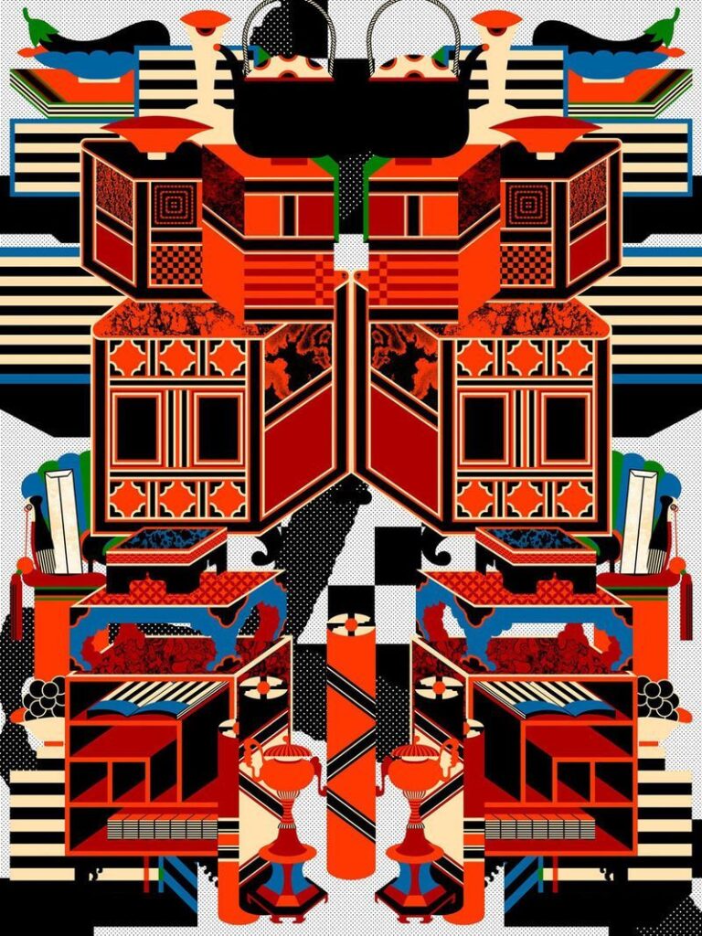
최근작 〈문방청완(文房淸玩)〉에서 그런 시도가 잘 드러나는 것 같아요. 현대적인 형태에서 전통적인 색감이 드러나고 전체적으로 활력이 넘치더군요. 조선시대 책가도의 사상과 가치를 재해석하는 이 작품은 어떻게 작업하셨나요?
Q4.
I think that kind of attempt is evident in your recent work Pure Enjoyment of Scholars’ Accoutrements (文房淸玩). The impression made by traditional Korean colors [white, black, blue, yellow and red] is revealed in contemporary forms in this work of yours, making the whole thing look vibrant. How did you work on such a piece, which reinterprets the idea and value of chaekgado (still-life paintings that depict mostly books and other associated objects) in the Joseon Dynasty?
저는 민화야말로 우리나라가 낳은 굉장한 그래픽 작품이라고 생각해요. 이미 하나의 그래픽으로 온전하게 완성된 상태라서 무언가를 더하기보다는 조형 세계를 현대적으로 분해하는 데 초점을 맞췄어요. 책가도는 장식적인 형태의 볼륨감을 가지고 있는데요. 수많은 민화 관련 자료를 찾아보며 제가 발견한 미감과 형태감으로 재조합했습니다. 제 모든 작업의 기초는 레이어인 것 같아요. 겹겹이 레이어를 만들어서 평면적인 이미지를 입체적으로 움직이는 것처럼 보여주고 싶었어요. 문자와 형태의 겹일 수도 있고, 전통과 현대의 겹일 수도 있습니다.
I think Korean folk painting is a great graphic genre that our country gave birth to. It’s already fully completed as a single graphic work, so I focused on disassembling its formative world in a more present-day way rather than adding something to it. Chaekgado has a decorative sense of volume. I searched for a lot of folk painting-related materials and recombined them with the aesthetics and sense of form I discovered. Additionally, much of my work is based on layers. I wanted to create layers to show a flat image as if it were moving in three dimensions. In the end, this can be seen as layers of letters and forms or layers of tradition and modernity.
Q5.
차별점에 대한 탐구와 노력이 한국적인 미학과 멋을 담아내는 작업으로 이어진 것 같네요.
Q5.
It seems that your exploration and effort to differentiate your designs led you to ultimately capturing Korean aesthetics and style very well.
사실 디자인은 누구나 할 수 있는 창작 행위에요. 그래서 누구나 할 수 없는 작업을 해야 한다고 생각했어요. 미니멀한 작업은 제가 아니더라도 잘하는 디자이너가 무척 많습니다. 저는 정적이고 중후하기보단, 장난기 있고 더 많이 풍요롭게 채우는 작업을 하고 싶었어요. 이제는 그게 저만의 색깔이 된 것 같아요. 정체성을 만들었다고 생각한 시점부터는 더욱더 거침없이 새로운 작업을 시도하면서 개념을 더하고 완성도를 높이는 노력을 지속했죠. 본질이 흐려지지 않는 선에서 시각적인 비틀기를 계속하면 독창적이고 유일무이한 결과가 탄생합니다.
Actually, design is a creative act that anyone can do, so I thought I should do something that not everyone could do. There are many designers who are quite good at minimalistic work, even if that doesn’t include me. I wanted to sink my teeth into something playful and enriching, rather than creating something static and dignified. I think I’ve managed to turn that into my own characteristic now. From the time I’d come up with my own identity, I continued to try new projects without hesitation, adding fresh concepts and increasing the degree of perfection I was aiming for. By continuing to visually twist— without blurring—the essence of each work, original and unique design results are achieved.
Q6.
유명한 〈축, 복〉 시리즈는 때론 섬세하게, 때론 역동적으로 한글을 활용하며 매번 다른 느낌을 연출합니다. 축복이라는 긍정적인 메시지를 담고 있다는 점에는 변함이 없고요. 매년 작업을 이어오는 이유가 궁금합니다.
Q6.
Although the famous Congratulations and Blessings series uses Hangeul, sometimes delicately and sometimes dynamically, to create a different impression every time a work is produced, there’s no change in that it contains a positive message of blessing. I wonder why you continue working on this same series each year.
〈축, 복〉을 처음 시작한 건 지난 2014년이었어요. 당시 타인을 비방하는 댓글 문화가 심각한 걸 보고, 반대로 복을 기원하는 의미로 포스터를 만들었죠. 아주 반응이 좋았고, 지인에게 선물하고 싶다는 사람이 많았습니다. 좋은 일을 기원하는 길상 문자의 현대화가 바로 그렇게 시작한 거죠. 누군가에게 의뢰받아 시작한 작업은 아니었지만 자연스럽게 다양한 방식과 매체로 계속하게 되었어요. 매년 새롭게 제작하면서 브랜드와 컬래버레이션을 하기도 하고, 연하장을 만들기도 했습니다. 상업적인 목적이 아니라 좋은 의미로 시작한 작업이라서 오랫동안 지속하며 확장하는 것 같아요. 사실 이 작업을 하기 전에 의뢰받은 작업은 클라이언트가 부정적인 피드백을 줬거든요. 그런데 제가 하고 싶은 대로 만든 작업이 오히려 호응을 얻고 입소문을 타게 되었죠. 그래서 요즘 젊은 디자이너에게 이런 이야기를 하곤 해요. 예전에는 상업적인 영역의 일이라고 하면 보통 의뢰를 받아서 시작했지만, 이제는 세상이 변했다고요. 스스로 자유롭게 콘텐츠를 생산하며 능력을 발휘하는 게 상업적인 일로 이어질 수 있다고 말이죠.
It was in 2014 when I first started the series. Back then, I saw vicious comments were a serious problem online, so to do something on the opposite end of the spectrum, I made posters to wish others good luck. Those posters were a big hit, with many people wanting to give one to friends and acquaintances. That’s how I started modernizing our tradition of auspicious writing. While it wasn’t a commissioned work, it naturally continued in various ways using different media. As I produced new pieces every year, I kept coming up with new ideas for the series. Once, for example, I collaborated with a commercial brand, and another year I made New Year’s cards. Probably because I started the series not for commercial reasons but for a good cause, it’s continued to grow over a number of years. To be honest, before I carried through with this project, a client had given me negative feedback on the work I was asked to do. However, when I decided to do this project just as I’d wanted, it ended up being rather well received and actually went viral. It should come as no surprise, then, that I tell young designers these days that in the past, when it came to commercial work, it was usually commissioned, but now the world has changed. If you create content in a free-spirited way and clearly display your abilities, it can one day lead to commercial projects.
Q7.
전통과 현대가 만날 때 생기는 대비의 긴장감을 조화롭게 풀어내려면 무엇이 필요할까요?
Q7.
What does it take to harmonize the tension between tradition and modernity?
한국적인 작업은 단순히 소재를 가져오는 데서 그치지 않아요. 한옥을 소재로 삼았다면, 한옥의 느낌으로 무언가 새로운 것을 만들어내면서 재해석해야 합니다. 결국 서로 다른 것이 부딪히고 융합하는 과정이 필요하죠. 감상하는 사람의 눈을 혼란스럽게 하면서도 미소를 지을 수 있을 만큼 재미있는 요소가 무엇인지 늘 고민하고 있습니다.
Korean-style work is not just about bringing Korean-sourced materials together. If you use hanok as a subject, for example, you should reinterpret it by creating something new that embodies the feeling of hanok. Eventually, the process in which different things collide and merge is necessary. I’m always thinking a great deal about what element would be funny enough to confuse the viewer’s eyes and make them smile at the same time.
Q8.
오래된 것과 새로운 것을 연결하고 확장하는 작업의 연장선에서 앞으로 어떤 디자인을 시도하고 싶으세요?
Q8.
What kind of design would you like to try in the future as an extension of your work connecting and expanding old and new?
자기만의 방식으로 오랫동안 시리즈를 작업하며 개념과 철학을 만드는 작가들이 많아요. 하지만 저는 그래픽 디자이너로서 주제에 맞는 매체에 대해 고민을 하는 편이에요. 지금까지 전통적인 요소를 직관적이고 명확하게 보여주는 작업에 집중했다면, 앞으로는 우리 일상의 소소함을 쌓은 기록물에 대한 작업을 해보고 싶어요. 과거에 대해 이야기하는 레이어를 아주 현대적이고 낱낱이 표현하고 싶습니다.
There are many artists who work on series in their own ways for a long time and devise their own concepts and philosophies. Yet as a graphic designer, I tend to think a lot about the specific media that fits each topic. If, up to now, I’ve focused on showing traditional elements intuitively and clearly, I’d like to work on records that have accumulated the smallness of our daily lives as I move forward. I’d like to present layers that talk about the past in a very current way and in great detail.
Q9.
마지막으로 디자인 철학에 대한 질문을 드리고 싶습니다. 그래픽 디자이너로서 가장 소중히 지키고 있는 가치는 무엇인가요?
Q9.
Lastly, I’d like to ask you a question about design philosophy. What value do you cherish most as a graphic designer?
제가 만약 금전적인 면에 중심을 두고 그래픽 디자인 작업을 이어왔다면 방향성이 좀 달랐을 것 같아요. 좀 더 오래 활동을 지속하고 싶다는 생각이 컸죠. 일본 유학 시절 제 스승님이었던 그래픽 디자이너 사토 고이치 선생님은 돌아가시기 전까지 작업을 계속하면서 전시를 여셨어요. 젊은 감각을 유지하며 에너지가 응축한 작품을 남기셨고, 협업도 활발히 하셨죠. ‘일본에서 가장 일본적인 디자인을 하는 디자이너’로 평가받으며 세계 유수의 뮤지엄에서 작품을 소장 중이에요. 선생님은 일본에 남아서 일하려는 제게 한국으로 돌아가서 가장 한국적인 것을 해보라고 조언해 주셨습니다. 한국적인 것이 정말 멋진데 그걸 잘 표현한 작업을 의외로 보지 못한 게 아쉽다고요. 지금은 돌아가셔서 제 작업을 보여드릴 수 없지만, 그분이 말씀하신 한국적인 작업을 남기고 싶어요. 어떻게 해야 더 진화할 수 있는지 늘 고민이죠. MZ 세대와 협업해도 뒤떨어지지 않는 감각을 유지하며 제 작업을 계속 이어 나갈 수 있으면 좋겠습니다.
If I’d focused on the financial aspect in continuing with graphic design, I think the direction of my work would have been a little different. For me, it was really important that I keep my design activities going for a long time. When I was studying in Japan, graphic designer Koichi Sato, one of my professors, continued working and holding exhibitions right up until he passed away. He left behind design works with so much energy condensed in them, all of which maintained a youthful sentiment to them, while at the same time actively collaborating with others. He was considered by many to be “the most Japanese graphic designer in Japan,” and a lot of his works are today housed in several leading museums around the world. Although I wanted to stay on and work in Japan, he suggested I return to Korea and do something “totally Korean.” He said that Korean style is really cool, but it was a shame that he couldn’t see design works that mirrored this style very well. I can’t show him my works now because he’s no longer with us, but I myself now want to leave behind the type of Korean-style designs he mentioned for posterity’s sake. I’m always concerned about how my work can evolve even further. It’s my hope that I continue doing what I do while keeping a solid head on my shoulders so that I don’t get left in the dust even when collaborating with millennials and Gen Zers.