과거를 바라보는 시선에 관하여
About a View on the Past
김기조는 21세기 디자인 신에서 복고 열풍과 레트로 유행에 중요한 흐름을 형성했다고 평가받는 그래픽 디자이너다. 2000년대 중반부터 복고적인 한글 레터링을 활용해 음반 커버 작업을 했고, 1970~80년대 포스터를 연상시키는 레터링을 끌어와 그와 대비되는 메시지를 담아내기도 했다. 과거의 것을 소재로 삼으며 그가 표현하고자 한 것은 무엇이었을까? 김기조를 만나 그의 이전 작업과 더불어 최근 새롭게 시도하는 작업에 관한 대화를 나눴다.
Kijo Kim is a graphic designer who is seen by many as spearheading an important movement in the retro craze/trend of Korea’s 21st-century design scene. Since the mid-2000s, he has used retro Hangeul lettering for album covers. He has also drawn letters reminiscent of posters from the 1970s and ’80s to convey messages contrary to the ideas they evoked in the past. What was he trying to express by using the past as a subject? We met up with Kijo Kim and had a conversation about his previous works as well as some of his new and more recent projects.
About the Interviewee
한글 레터링으로 잘 알려진 한국의 그래픽 디자이너. 서울대학교에서 시각 디자인을 전공했다. 학생 시절부터 독립 음반 레이블 붕가붕가레코드의 창립 멤버이자 수석 디자이너로 활약하며 ‘장기하와 얼굴들’, ‘브로콜리너마저’ 등 여러 뮤지션의 음반 아트워크를 담당했다. 2011년 디자인 스튜디오 기조측면을 설립해 운영하고 있으며, 포스터, 전시, 공연, 영상 매체 등 다양한 영역에서 활약 중이다.
A Korean graphic designer well known for his Hangeul lettering, Kim majored in visual communication design at Seoul National University. Starting in his school days, he actively worked as the founding member and senior designer for an independent music label, BGBG Record, and was responsible for the album artwork of many musicians, such as Kiha & The Faces and Broccoli You Too. He founded design studio Kijoside in 2011, and has since been working in a variety of areas, from posters and exhibitions to performances and video media.
Q1.
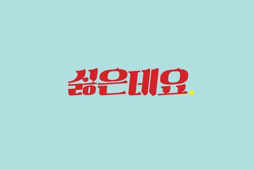
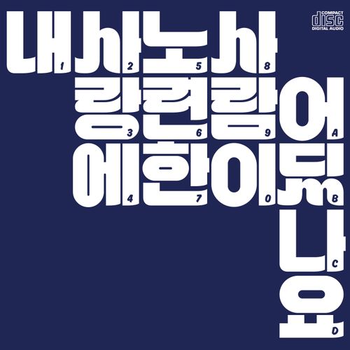
‘김기조’라는 이름을 들었을 때 떠오르는 가장 익숙한 작업 중 하나로 소위 복고풍이라 불리는 한글 레터링 작업을 빼놓을 수 없습니다. 붕가붕가레코드에서 시각적 정체성을 만들던 2000년대 중반의 초기 복고풍 레터링 작업은 어떻게 시작하게 되셨나요?
Q1.
One of the most familiar trademarks that comes to mind when we hear the name Kijo Kim is “retro-style” Hangeul lettering work. How did you get started with your early retro lettering work in the mid-2000s when you were creating visual identities at BGBG Record?
제 작업의 시작은 한 마디로 ‘의도된 시대착오’였어요. 당시 저는 과거에 있던 것을 재현하고 싶다는 생각은 별로 없었어요. 유지나 계승의 개념보다는 시대착오적인 이미지로 충격을 만들고 싶었죠. 변방적이면서 결핍이 있는 상태를 표현하기 위해서 그래픽의 원천을 예전의 것에 두고 소위 복고풍으로 부르는 작업을 했어요. 그런데 얼마 지나지 않아 그게 무례했다는 생각이 들더군요. 후대의 관점에서 시대적 결과물을 바라볼 때는 맥락을 살피며 더 진지하게 고민하는 태도가 필요하다는 걸 느꼈어요. 다만, 그 과정에서 글자를 그리는 기능적인 작업의 역할은 중요했습니다. 현재의 관점에서 과거를 재단하고 평가하는 게 아니라, 오롯이 과거에 존재하던 조형적인 규칙에만 집중하면 좋은 작업이 나올 것 같았어요.
The beginning of my work was, quite simply, intended anachronism. At the time, I didn’t really want to recreate what had been done in the past; I wanted to create a shock with an anachronistic image rather than the idea of maintaining or inheriting something. In order to express a peripheral and deficient condition, I found my source for graphic images in things of the past, and subsequently created so-called retro style works. But it didn’t take long before I saw my method as offending people. Thus, I felt it necessary to take a closer look at the context and think more seriously when going over the results of work related to a previous era, yet from a later generation’s point of view. During this process, the functional role of drawing letters became more important. I thought that good artworks could be realized if I focused solely on the formative rules that existed in the past, not judging and evaluating the past from today’s perspective.
Q2.
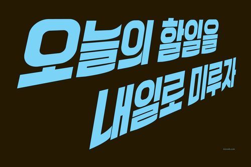
작업 초기부터 작업 태도에 대한 성찰이 먼저 이루어졌네요. 음반 아트워크 외에도 ‘오늘의 할 일을 내일로 미루자’처럼 메시지를 담은 레터링 작업도 무척 인상적이었습니다.
Q2.
Ever since the start of your career, you seem to have first reflected on your work attitude before anything else. In addition to the album artwork, which was really great, your lettering works with messages such as Let’s put off today’s work until tomorrow were also very remarkable.
‘오늘의 할 일을 내일로 미루자’는 2005~2006년 즈음의 작업이에요. 지금은 그런 느낌의 글자를 많이 볼 수 있지만, 제가 작업할 때만 해도 굉장히 생경했어요. 당시 청계천 일대의 복원 사업을 진행하면서 개발을 둘러싼 이슈가 있었죠. 저는 그런 상황에서 국가가 개인에게 아직도 근면성실을 강요하고 모두가 미래지향적으로 달려 나가는 게 당연한 것처럼 주장하는 메시지가 나오는 걸 목격했어요. 그래서 저는 반(反)개발주의적인 메시지를 내놓기로 했죠. 과거의 표어나 포스터를 연상시키는 글자와 말투를 사용해 21세기를 사는 제 목소리를 담아냈어요. 굵직하고 선동적인 느낌의 글자로 힘 빠지는 이야기를 한 거죠. 당시엔 효과가 있었다고 생각했지만, 나중에는 마치 ‘게을러도 괜찮은 나’를 표현한 메시지처럼 퍼지더라고요. 그에 대한 불만은 없어요.
“Let’s put off today’s work until tomorrow” was a design work I completed around 2005. That kind of impressive font can easily be found in many places these days, but back when I was putting the project together that font was pretty unfamiliar to most people. At that time, there was an issue surrounding urban development while the government was carrying out the Cheonggyecheon Stream restoration project in Seoul. That’s when I saw that the state was still forcing people to work their fingers to the bone and that a message was coming out to claim it’s natural for everyone to move forward in a future-oriented manner. In response to this, I decided to come out with an anti-development message. I used words and phrases reminiscent of slogans and posters from the past to capture my voice, someone living in the 21st century. I presented an idle message using a weighty, inflammatory font. Personally, I thought it was effective, but later the lettering work took on a life of its own and came to be understood as “It’s okay to be lazy.” I have no complaints about that, though.
Q3.
작가님은 지나간 것, 세월의 가치가 쌓인 것, 과거 우리의 정서 등에 관심이 많은 것 같아요.
Q3.
It would appear you are very interested in the past, things that have accumulated value over the years, and sentiments we used to revel in.
확실히 그런 면이 있어요. 우리나라는 변화의 스펙트럼을 고찰할 여유도 없이 바뀌는 게 너무도 많아요. 저는 변화가 급격하지 않았으면 좋겠습니다. 단순히 과거의 것이니까 남겨야 한다는 뜻은 아니에요. 마땅한 인과 없이 사라지고 지워지는 게 싫은 거죠. 예전부터 그런 부분은 크게 다가왔고 작업에도 영향을 미쳤습니다.
Yes, that’s definitely part of who I am. In Korea, there are so many things that change even when we don’t have the necessary time to consider the whole spectrum of change. I don’t like drastic changes. It doesn’t mean we should keep something exactly the same simply because it’s from the past. I hate it when something disappears or is erased without a justifiable reason. I’ve strongly felt that way for man years, and it’s long influenced my work.
Q4.
요즘도 거기에서 영감을 받으시나요?
Q4.
Are you still inspired by the things I just mentioned?
어쩌면 3차원적인 형태인 것 같아요. 시간의 흐름이 하나의 축이 되고, 공간의 범위가 있고, 그 안에 쌓인 것이 있죠. 예전의 것이나 지금 현재 벌어지는 이슈와 사건, 과거와 현재 사이에 켜켜이 쌓인 것들이 모두 작업의 원천이 돼요. 그래서 단순히 과거 어느 한 시점을 포착하기보다 현재 제가 가진 스키마schema를 바탕으로 작업해요. 이 스키마는 지난 시간을 겪으며 직간접적으로 경험한 다양한 것으로 구성돼 있죠. 굉장히 종합적입니다.
Maybe my inspiration is three-dimensional. The flow of time is one axis, a range of space is a second axis, and a third axis is made up of piles of stuff in between it all. Things from the past, the issues and events that take place in the present, and the accumulated things between the past and the present all form the genesis of my work. As a result, rather than simply capturing a certain point in the past, I carry out my work based on a plan I’ve already laid out. This plan consists of a wide range of direct/indirect experiences throughout the past and is very comprehensive.
Q5.
레트로 디자인의 유행에 ‘김기조 스타일’이 큰 영향을 미쳤다는 평가가 많아요. 작가님의 초기작 이후 나온 수많은 작업을 어떻게 바라보시나요?
Q5.
Many people say that the “Kijo Kim style” had a significant influence on the overall retro design trend in Korea. What do you think of the numerous similar-styled works that have come out since your early work?
레트로 디자인의 유행을 제가 촉발한 것인지에 대해서는 잘 모르겠어요. 제가 평가할 일도 아니라고 생각하고요. 다만 어떤 장르에서든 금과 옥이 있다고 생각해요. 갑자기 무언가가 크게 유행할 때는 먼저 나온 것을 흉내만 낸 얄팍한 작업도 있지만, 새롭고 멋지게 해낸 작업도 존재하죠. 시각적 결과물을 두고 누구의 스타일이라고 부르는 경우가 별로 없는데요. 그래서 저는 소위 ’김기조 스타일’이라고 명명하는 것만으로도 충분히 감사한 일이라고 생각해요.
I’m not sure if I triggered a retro design trend. I don’t think it’s something for me to evaluate. But I do think there are always truly great works in any genre. When something suddenly becomes a big hit, there are shallow works that imitate what came out earlier, but there are also new and amazing works. We don’t often refer to someone’s visual output as a certain style, which I guess is why I’m grateful that people call it the “so-called Kijo Kim style.”
Q6.
레터링뿐 아니라 메시지까지 함께 창작할 때, 작업은 어떤 방식으로 진행되나요?
Q6.
When creating not only lettering but also messages, what is the work process like?
생각을 품고 곱씹다가 압축시킬 수 있을 때 비로소 형태를 가진 이미지로 옮겨냅니다. 그래서 시간이 가장 많이 필요하죠. 2014년 말 아르코미술관에서 열린 《즐거운 나의 집》 전시에 참여하며 포스터 연작 네 점을 만든 적이 있어요. 집과 주거문화를 바라보는 작가들의 다양한 시선이 담긴 작업 중에는 굉장히 냉정하게 현실을 돌아보게 만드는 작품도 있었는데요. 제 작업이 바로 그 옆에 설치됐어요. 고민 끝에 네 가지 컬러로 ‘선착순, 평생, 마지막, 기회’라는 단어를 포스터로 작업했습니다. 사람들의 불안감을 자극해 수요를 만들어내는 분위기를 네 가지 키워드로 압축해 추출한 거죠. 결국 이것도 재료인데요, 재료는 창작자가 원하는 방향에 따라 다르게 사용할 수 있어요. 그래서 목적의식의 존재를 인지하며 작업하는 게 중요하다고 생각해요.
At first I think long and hard about something. Then, and only when I can compress my thoughts, I transform them to an image that has a shape. That’s why, more than anything else, I need a lot of time. At the end of 2014, I participated in the Home, Where the Heart Is exhibition at the ARKO Art Center and made four posters for a series. Among the various perspectives of artists examining home and housing culture, there was one work in particular that had the viewer look back on reality very calmly. My work was installed right next to it. After much consideration, I used four colors in the posters for the Korean words that meant “first come, first served; last; chance; of a lifetime.” I extracted those four keywords by compressing the atmosphere that stimulates people’s anxiety and creates demand for real estate. After all, each element is also a material unto itself and can be used differently depending on the direction the creator wants to take. Hence, I think it’s important to recognize a sense of purpose while working.
Q7.
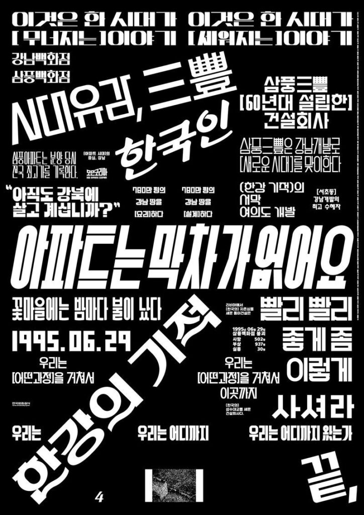
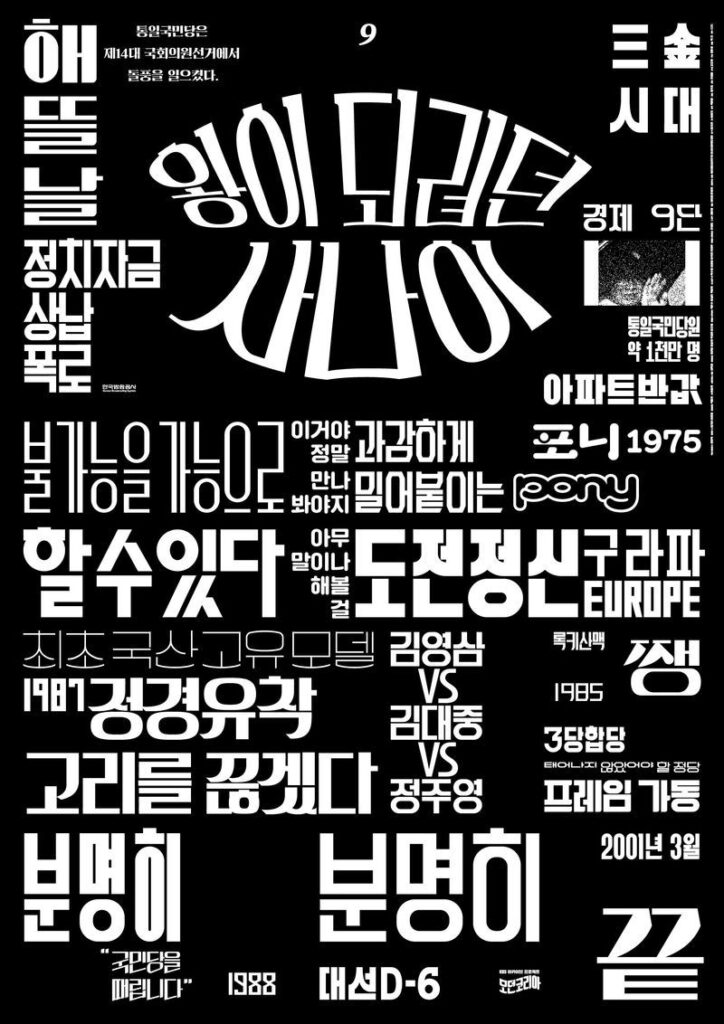
미술감독으로 참여한 KBS 아카이브 프로젝트 〈모던코리아〉에서는 시대적 감성을 담아내면서도 세련된 느낌을 주는 타이포그래피를 선보이셨어요. 올해 말 공개할 다음 시즌에 대해서 기대가 큰데요, 공영방송에서 자유로운 실험을 하신 게 신선하게 다가왔어요.
Q7.
In the KBS archive project “Modern Korea,” in which you participated as an art director, you presented typography that captures the sensibility of the times while also embodying a sophisticated feeling. I’m looking forward to the next season of the project, which is supposed to be released later this year. It was refreshing to see you had a free-spirited experiment on a major TV network. Can you tell us more about the next season?
이태웅 PD님과 10여 년의 시간 동안 여러 작품을 함께 하며 신뢰를 쌓은 영향이 컸어요. 첫 번째 시도에서 했던 모험적인 작업과 그 후에 제가 해온 방법이 긴 시간을 통해 검증받은 셈이기도 했고요. 어느 순간부터는 조금씩 더 과감한 시도를 했는데 그 결과물이 긍정적인 피드백을 받으면서 더욱더 용기가 났습니다. 한 번에 나온 게 아니라 점진적으로 한 발짝씩 나아간 작업이었죠. 프로젝트를 할 때마다 다음에 바꿔보고 싶은 부분을 생각해서 반영했고, 이렇게 새로운 시도를 했을 때 이태웅 PD님을 비롯한 스태프들이 믿음을 보여주셨어요. 다음 시즌을 기다리는 분들도 많고, 저도 기대하고 있는 작업입니다.
My free-spirted approach to the project was largely due to the fact that the producer, Lee Tae-woong, and I had built up mutual trust over the many projects we worked on together for more than 10 years. In other words, the adventurous work I’d done on a first attempt and the subsequent work I did later proved to be pretty good over a long period of time. At some point, I started to make bolder attempts little by little, and I grew more courageous as the results of my work received positive feedback. A refreshing work didn’t come out all at once, but was based on a step-by-step process. Whenever I worked on a project, I thought about what I wanted to change next and reflected it in the following project. When I tried something new like that, Lee Tae-woong and other staff members would grow to trust me even more. There may be a lot of people waiting for the next season of the program, but I’m looking forward to it as well.
Q8.
스튜디오를 운영하며 큰 기업과 협업할 때, 혹은 의뢰받은 작업을 할 때는 자신의 색을 보여주는 결과물을 내놓는 게 늘 쉽지만은 않을 텐데요. 그럴 때 디자이너의 역할에 대해 어떤 고민을 하세요?
Q8.
I guess it is not always easy to produce results that show your standard trademarks when you run a studio and collaborate with a large company or work on a commissioned task. In cases like that, what for you is the deeper role of a designer?
요즘은 디자이너가 뭔가를 해주는 사람이라기보다 하면 안 되는 걸 막아주는 사람이 아닐까 생각을 하곤 해요. 저는 결과물에 욕망이 많이 담길수록 좋은 디자인이 되지 못한다는 점을 중요하게 생각해요. 친절하고 설명이 많으면 의도가 드러나게 되는데 그게 촌스러울 수도 있어요. 반대의 경우, 세련된 작업이지만 불편한 면이 존재하겠죠. 여러 가지를 생각하며 어느 지점에서 작업해야 하는지 잘 판단해야 해요. 상업적인 작업의 경우에는 보통 클라이언트가 하고 싶은 게 정말 많거든요. 디자이너가 중심을 잘 잡아가면서 하지 말아야 할 것을 선택해 정리하는 역할을 맡아야 해요.
These days, I don’t think a designer is someone who does things for others, but instead somebody who prevents them from doing things they shouldn’t do. The more people’s desires are contained in the result, the less exceptional the design is. I think that’s important. Even if you’re kind and explain a lot about your design, revealing your intentions in the design along the way, the final result can still end up being tacky. On the other hand, a sophisticated work can have uncomfortable aspects to it. You have to think about many things and decide wisely how to deal with them before you create your artwork. In the case of commercial work, there are usually a lot of things that the client wants to do. A designer should be in charge of choosing and organizing what the client shouldn’t do while keeping the project balanced in its entirety.
Q9.
요즘은 시대적 맥락을 벗어난 작업도 많이 하시는데요. 지금까지 해오신 작업의 연장선상에서 앞으로 더 하고 싶은 디자인은 어떤 것인가요?
Q9.
These days, you do a lot of work outside the context of the times. What kind of design do you want to work on in the future as an extension of your work so far?
디자이너로서 제 정체성을 만들어준 예전 작업은 온전히 제게서 출발한 작업이었어요. 지금은 그 시기로부터 확장한 작업을 하면서 무던하게 이어가고 있는데요. 제 정체성을 유지하기 위해서는 다시 조금씩 제 목소리와 의도가 담긴 작업을 해야겠다고 생각합니다. 생업으로 꾸준히 해온 여러 가지 작업은 물론 중요하지만, 제가 이야기하고 싶은 것을 모두 담아내기엔 불가능하거든요. 앞으로는 밸런스를 맞추면서 개인적인 작업도 많이 하고 싶어요. 지금으로서는 그게 무엇이 될지 모르겠지만, 상업적인 목적보다는 제가 재미있어서 하는 작업, 기본으로 돌아가 나 자신에게서 비롯한 작업을 하고 싶습니다.
Past projects of mine that created my identity as a designer always started entirely with me. Today, I continue to work smoothly while expanding my work from those years. In order to maintain my identity, I think I should work on things that contain my voice and intentions bit by bit once again. Of course, the various projects I’ve been doing steadily for a living are important, but it’s impossible to capture everything I want to talk about in commercial projects. In the future, I want to strike a balance and complete a lot of personal projects. For now, I don’t know what exactly that will entail, but what I do know is that instead of working exclusively on commercial projects, I want to go back to basics and pursue artworks that originate from within me.